Although there are some pretty nice tutorials of Python profiling out there, it’s always good to have an overview of the tools available for code analysis. So, without further ado, let’s bring out the shiny commands.
Note that the short snippet of code used in the demos of this overview is the one nicely put together in this stackoverflow answer, but a bit modified.
Default profiler dump analysis
The built-in cProfiler is a very handy, albeit a bit too detailed tool for in-depth analysis of the running code. Its output is a profile dump of the running script which can be visualised either in text-mode or visually through third-party tools.
The reason I say it is a bit too detailed is that the tracing of functions is done deterministically and while it does gather significant data, it also has two side-effects:
- The tracing imposes a quite large processing power overhead which excludes using it, as an example, in a web site backend that is deployed on a public server.
- It tends to generate large amounts of data for increasingly complicated scripts.
However, it does represent a powerful tool and it is quite easy to use. In order to launch it, the module can be loaded in the command line with the script to profile as an argument:
python -m cProfile -o profile_dump.prof script.py
The module can also be loaded into the actual code, as described in the official documentation, and used to profile specific modules or functions.
The time overhead of cProfile can be erratic and it cannot be approximated as a specific percentage of the original running time. The running times without tracing in the example script were
naive function time in seconds: 0.34552884101867676
historic function time in seconds: 0.04404902458190918
regexp function time in seconds: 18.06550693511963
The running times while profiling the code were
naive function time in seconds: 4.920273065567017
historic function time in seconds: 0.05976986885070801
regexp function time in seconds: 18.22123098373413
It can be seen from the timings that the historic function suffered an increase of 35% with the profiler activated, the regexp function had 0.88%, while the naive function time had a 1347% increase in execution time. It varies upon the actual code implementation.
After running the above mentioned script, though, we got ourselves a nice binary file called profile_dump.prof with the profiling results. These can be visualised in the command line by using Python’s standard library module pstats:
python -c '__import__("pstats").Stats("profile_dump.prof").sort_stats("time").print_stats()'
This handy command orders the function calls by total time spent while executing them. The first few lines of output in the prime number generation script example are
Tue Apr 8 10:50:02 2014 profile_dump.prof
66296 function calls (66278 primitive calls) in 20.621 seconds
Ordered by: internal time
ncalls tottime percall cumtime percall filename:lineno(function)
8000 18.110 0.002 18.110 0.002 {method ‘match’ of ‘_sre.SRE_Pattern’ objects}
7918 2.320 0.000 4.896 0.001 {built-in method all}
7918 0.051 0.000 0.053 0.000 script.py:20(_prime)
We can see here that the regex re.match function was called 8000 times and takes up most of the execution time with 18.110 seconds with 0.002 seconds of execution time per call (in average).
The information described is quite useful, but text mode cand be boring and/or confusing sometimes. How about prettyfying it a bit?
Drawing call graphs
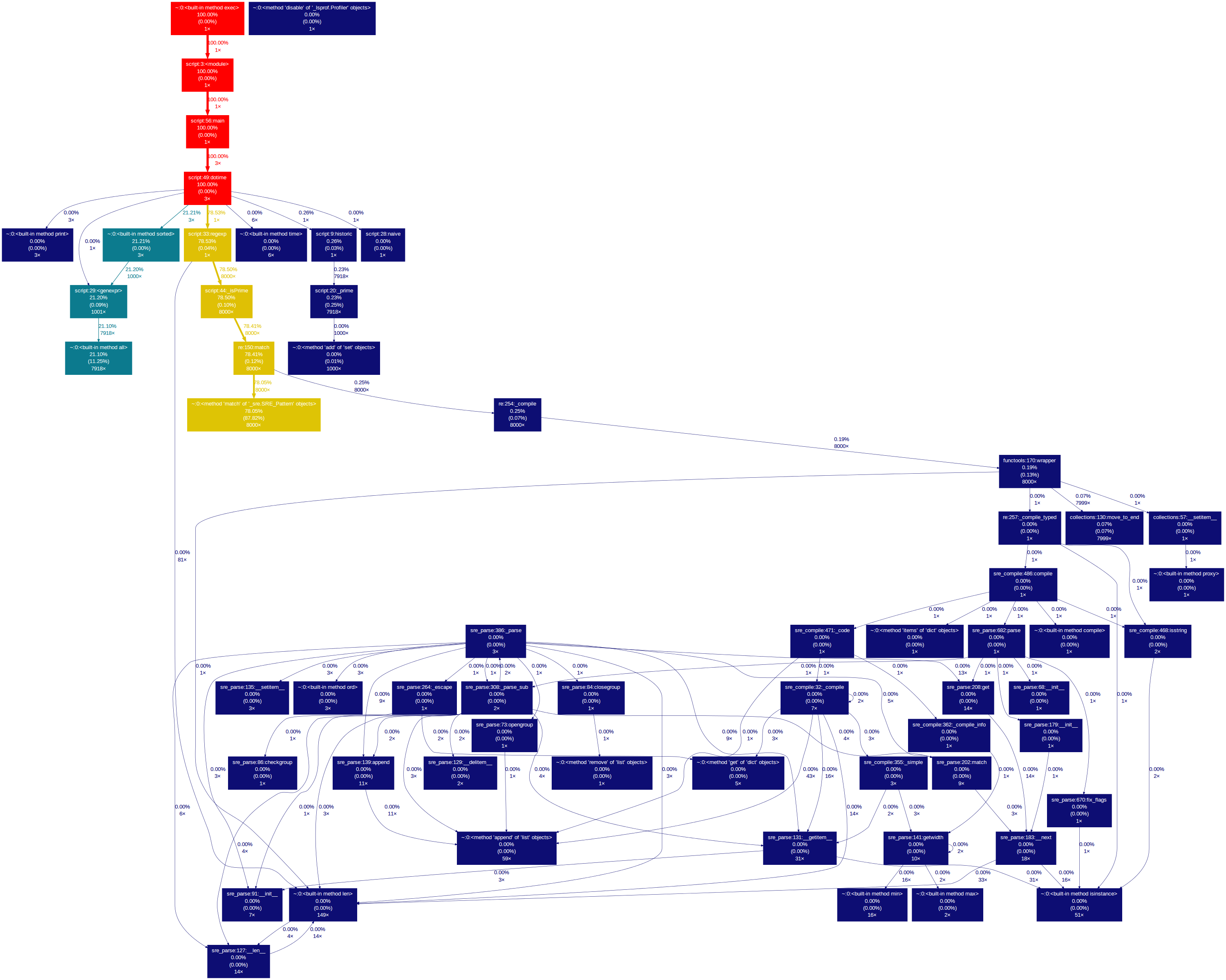
Gprof2Dot is a call graph drawing tool which can receive as input multiple types of profile dumps, including cProfile’s pstats type. It is using the Graphviz suite to write the actual image, so it has a few dependencies. However, after installing it with pip install gprof2dot, the call graph can be created as easily as
gprof2dot.py -f pstats profile_dump.prof | dot -Tpng -o profile_graph.png
This command takes the profile_dump.prof file, reads the information, ‘translates’ it to dot format and then passes it to the dot executable which compiles the image into the profile_graph.png file.
Our little script profile dump generates the following image:

The nodes represent the functions executed in the script. In the nodes and on the edges there is information about the percentage of time spent inside the functions and calling other functions. The colour code signals the functions that took longer to execute i.e. those that have a colour closer to the red zone of the visible spectrum (although that can be changed in the command line arguments).
Take the dotime function node, for example. Its execution time represented 100% of the total execution time (unsurprisingly, being the main function) and 78.53% of that time is spent calling the regexp function just once.
The gprof2dot.py executable has two thresholds that limit the amount of information displayed – the –node-thres and the –edge-thres values. These can be tweaked to display only those functions that took more than a fixed percentage of the total time to execute. Filtering relevant data is crucial and makes the difference between visualising the data as an image or as simple text – for example, our little script profile data generates the following graph with these thresholds set to 0:
Mind-boggling.
Pretty circles
Another way to see the call graph is to use the SnakeViz visualisation tool. This is actually a Tornado server with a nice JavaScript-based visualisation tool which loads a profile dump and displays it in a browser. If the installation (through pip install snakeviz) goes smoothly, you can launch it by simply typing
snakeviz profile_dump.prof
and voilà:
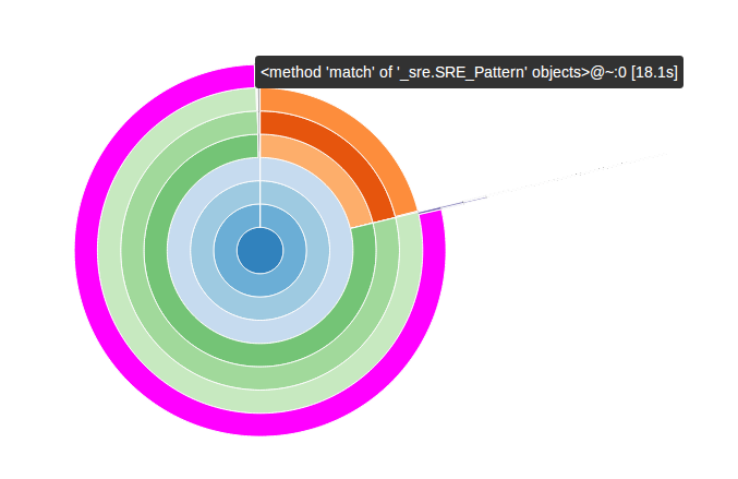
In this diagram the functions are organized as arcs and their position relative to the center of the diagram represents how low they are in the call graph – the main function is in the middle. If the cursor hovers over an arc, a bubble appears with information about the function profile.
Now, personally (i.e subjectively), I don’t really enjoy this visualisation mode because I consider it too cluttered and implies too much hovering with the mouse cursor over every arc, but fortunately SnakeViz includes another tool – it structures the pstats information into a nice table which can be ordered by any column through a simple click and, overall, is nicer to read:
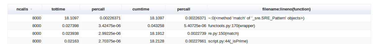
So, if text mode is not really for you, SnakeViz offers an enjoyable visualisation tool for the pstats data.
Update: The snakeviz tool is one of the few that has support for Python 3, so that is something to keep in mind for future reference. Also, once it upgraded its support, it has also slightly improved its visualisation tool, although it is based on the same design.
Heavy cProfiler guns
RunSnakeRun is a profile dump analysis tool similar to KCachegrind which offers more in-depth information about the analyzed functions. It can be installed through pip install runsnakerun and launched by
runsnake profile_dump.prof
Its interface looks a bit cluttered at a first glance:

but the important bits are quite easy to follow: to the left is the call table similar to that of the pstat’s print_stats() output, but with more information – it can represent the time spent inside functions as a percentage of the total execution time – and to the right are the call graph represented as a square map and details about the selected functions.
Our small script profile data appears visually uninteresting, so we will generate some more complex profile data to see in RunSnakeRun by profiling RunSnakeRun itself (because reasons):
python -m cProfile -o runsnake.prof /usr/local/bin/runsnake profile_dump.prof
This generates runsnake.prof which we can analyze with runsnake:
runsnake runsnake.prof
and in the main window, if we select the function OnMouseMove by double-clicking it, the square call map is represented as follows:
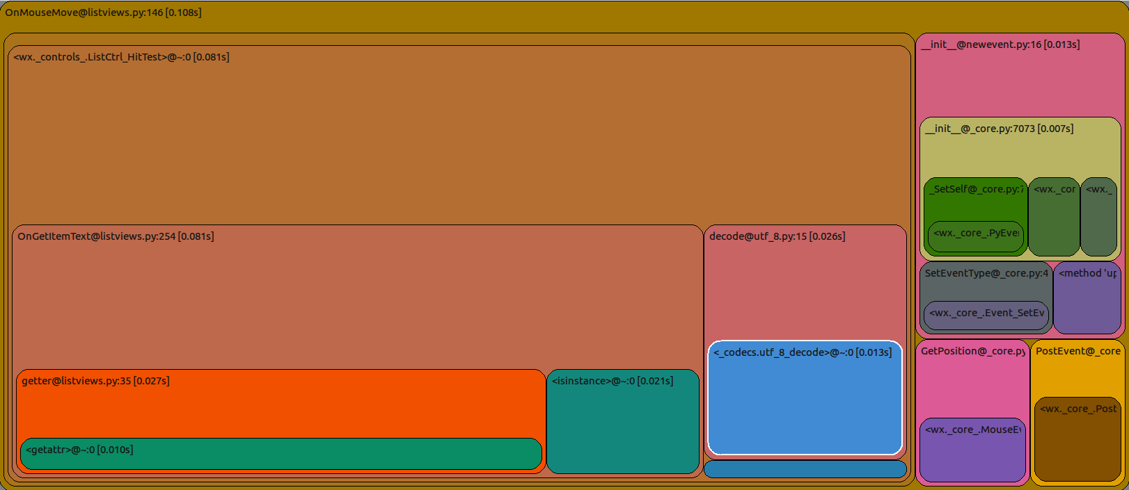
The colours are not pretty, but the amount of information is quite efficiently packed. This shows the functions that were called when OnMouseMove was executed by representing them as (rounded) squares. The size of these squares is proportional with the amount of time it took for them to be finished. The larger the square – the more expensive was the execution of that function. The squares are nested, which means that the child function squares were executed by the parent function square. It is just another way of visualising a call graph.
I mentioned that RunSnakeRun is similar to KCachegrind. The reason why KCachegrind cannot be used is that it cannot parse the pstats dump files in order to represent the data. However, there is a script for that. pyprof2calltree converts the data gathered by cProfile into data that can be parsed by KCachegrind and automagically launches the program if we want it to. After it is installed (by using pip install pyprof2calltree) and if kcachegrind is available in the system path, it can be used by typing
pyprof2calltree -i profile_dump.prof -k
and KCachegrind is launched:
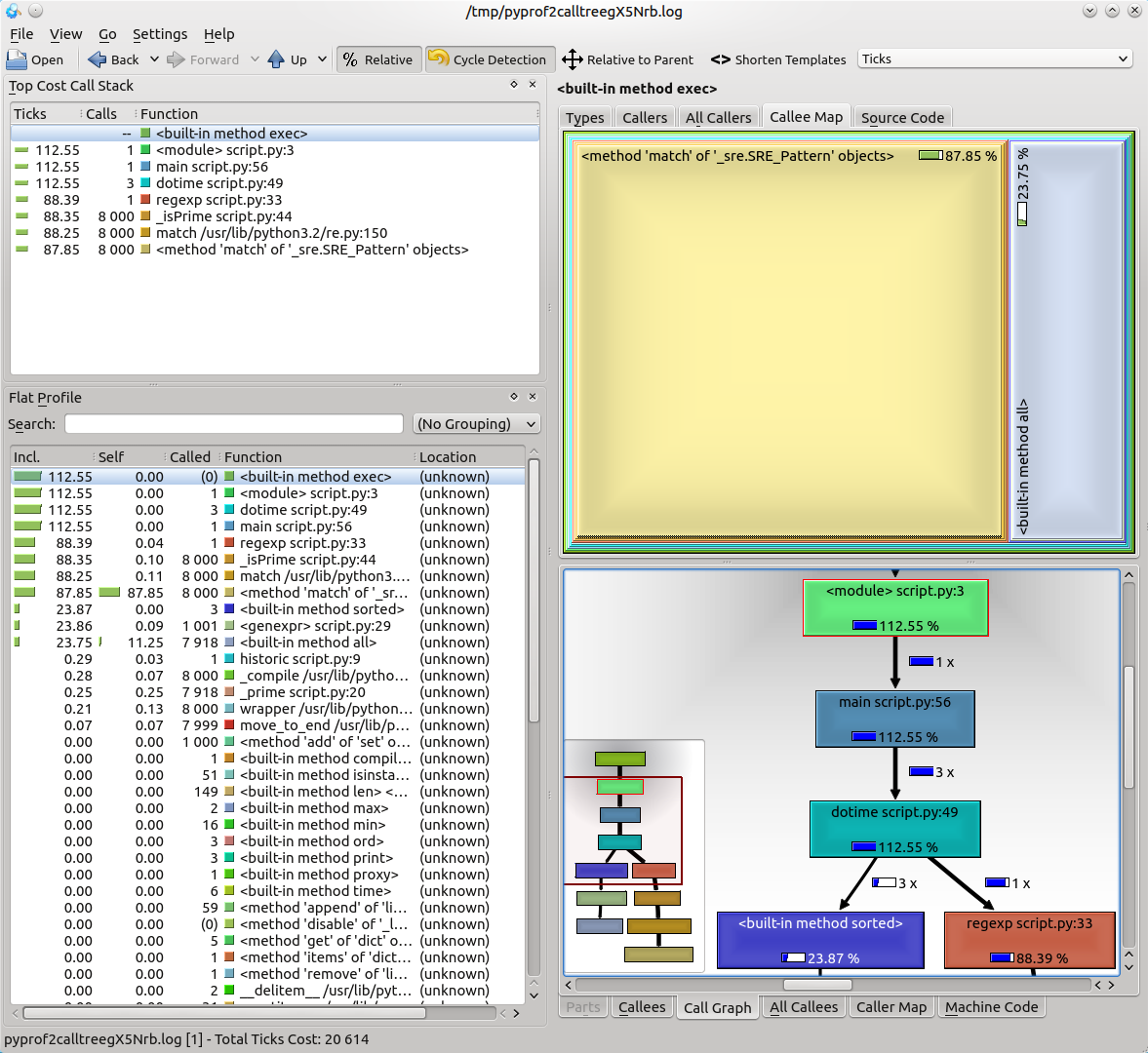
This little piece of software was built for profile analysis more than 10 years ago and has accumulated some nice features over the time. It has a plain call tree, a square map call graph, information about function profiles organized in a table and can export images with the call trees if you want to use them in a presentation / document. It’s not pretty, but it does its job well.
Update: This tool has support for Python 3.
Tearing apart a function
Once a troublesome function is identified, the process of profiling may not be actually finished. Some functions are overly complex and the source of the problem may be unclear. This is where a line profiler shines.
The kernprof.py script uses the line_profiler python library to time the individual instructions from a python function and present statistics about every line of code that was executed in a function.
Once it is installed, it can be launched by using the command line
kernprof.py -v -l script.py
but with a catch. In order to pinpoint the function that must be profiled, the code must be modified by using a special decorator called @profile over the actual function. The line_profiler module is resource-intensive and it is not recommended to use it over multiple functions, because it might skew the analysis process.
However, once the execution is finished, the kernprof.py script presents the code analysis. In our script, the function profiled was historic:
Wrote profile results to script.py.lprof
Timer unit: 1e-06 s
File: script.py
Function: historic at line 9
Total time: 0.20745 s
Line #      Hits         Time  Per Hit   % Time  Line Contents
==============================================================
     9                                           @profile
    10                                           def historic(n):
    11         1            6      6.0      0.0      primes = set([2])
    12         1            2      2.0      0.0      i, p = 2, 0
    13      7918         8657      1.1      4.2      while True:
    14      7918       182861     23.1     88.1          if _prime(i, primes):
    15      1000         1881      1.9      0.9              p += 1
    16      1000         1127      1.1      0.5              if p == n:
    17         1            1      1.0      0.0                  return primes
    18      7917        12915      1.6      6.2          i += 1
Oh no! The _prime function call takes 88.1% of the total function execution time! The horror!
While this case is trivial, in real life this may well save you some precious time by showing interesting side-effects and statistical data about code execution, line-by-line.
End of part I
This concludes the first part of profiling in Python. There might be a lot more to say about deterministic profiling, and not only in Python, but in the next part I will be writing about something a bit more unusual and practical (in theory) than that.
The First Rule of Program Optimization: Don’t do it. The Second Rule of Program Optimization (for experts only!): Don’t do it yet.
— Michael A. Jackson
Until next time!